Why many cultural organisations design for themselves - not their visitors
The uneasy feeling
A few months ago I walked into a cultural organisation I very much wanted to admire.
The building was handsome. The interpretation was thorough. The shop beautifully curated. The staff knowledgeable and committed.
And yet within ten minutes I felt slightly foolish.
Not unwelcome. Not excluded. Just not quite the intended reader of the script.
The panels assumed prior knowledge. The themes were arranged around internal categories rather than human curiosity. The tone was confident, but not generous. It felt as though the organisation had worked very hard to explain itself - but not to meet me.
This is more common than we admit.
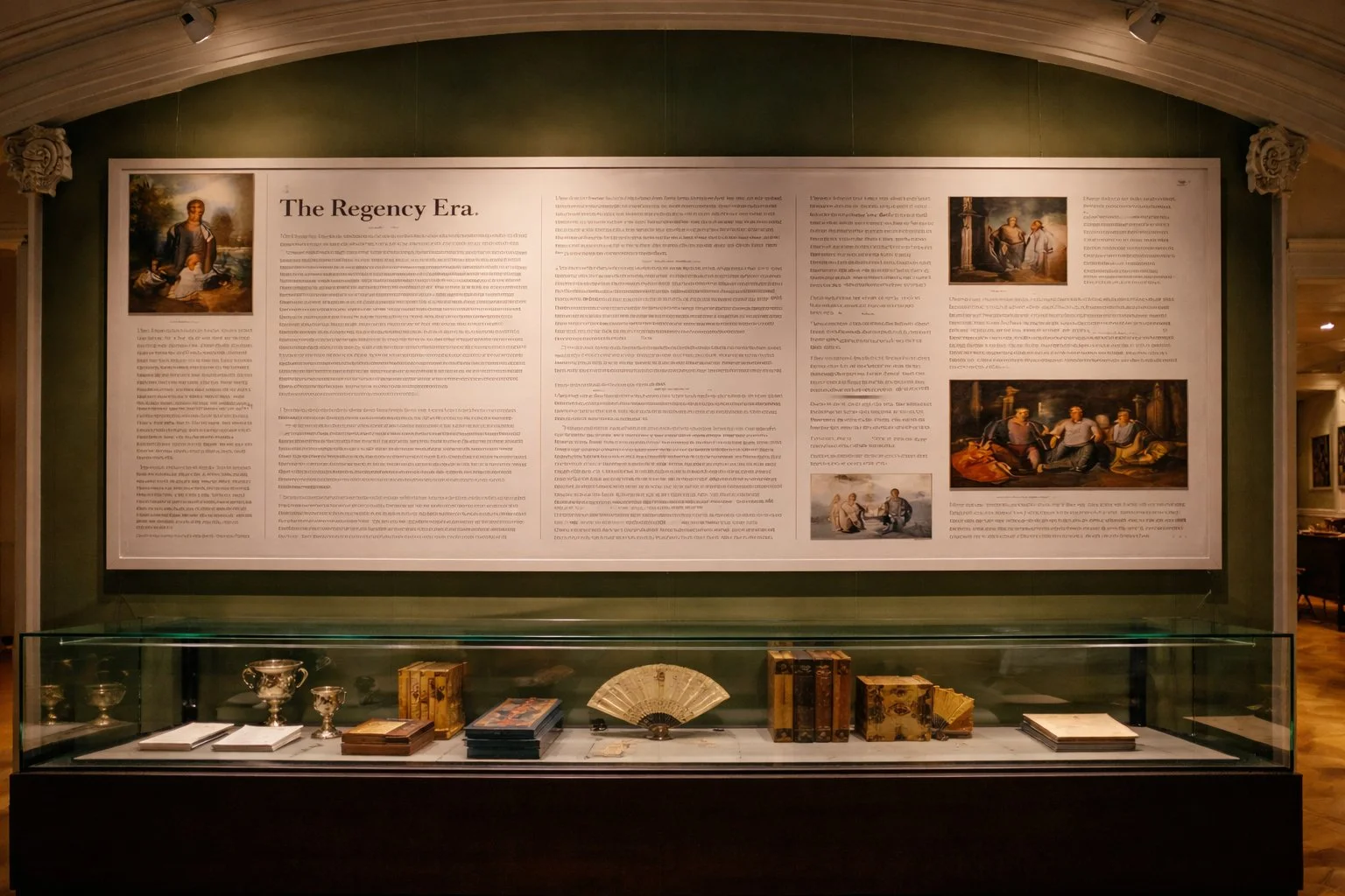
Dense interpretation can demonstrate expertise - but without context or welcome, it can also overwhelm.
The invisible shift
Over time, cultural organisations accumulate expertise. They know their archives, buildings and collections intimately. They refine nuance. They protect standards. They become, quite rightly, custodians of something significant.
But slowly, the centre of gravity shifts.
Language becomes internal. Structure follows scholarship rather than visitor flow. Commercial activity sits slightly apart, as though it were a necessary compromise rather than a natural expression of identity.
And two important things often fade.
The missing welcome
Visitors arrive with simple, generous questions:
What is this place?
Why does it matter?
What is so special about this place?
What can I do here?
How should I begin?
Too often, places move straight to subject matter. Date. Object. Context.
Without orientation, information floats. Without a clear statement of significance, visitors work too hard. If someone cannot understand why this place is distinctive within the first few minutes, something fundamental has been missed.
A welcome is not administrative. It is interpretative. It frames everything that follows.
A clear introduction - explaining what the place is, why it matters and why it is distinctive - frames everything that follows.
The relevance gap
Many places speak fluently to intellectual energy.
Detailed interpretation. Long labels. Specialist tours. Audio guides rich with information.
Sometimes there are physical activities too - workshops, trails, participatory moments.
But far fewer consciously design for emotional or spiritual connection.
Where can someone feel something rather than simply learn something?
Where is the moment of recognition?
Where is the shared human thread that bridges archive and experience?
Visitors do not arrive motivated by taxonomy. They arrive motivated by belonging, ambition, conflict, love, loss, beauty, injustice, curiosity.
When a place begins with internal structure, it risks building a wall. When it begins with shared human themes, it opens a door.
Designing only for the mind - and occasionally the body - misses the heart.

Not every connection is intellectual. Places also need space for pause, reflection and emotional response.
The quiet consequence
When visitors feel slightly unsure, they rarely complain. They simply disengage a little.
They move on sooner than they might.
They buy less than they could.
They do not quite return.
Designing for visitors does not mean simplifying significance. It does not mean diluting scholarship. It means translating depth into generosity.
When people feel oriented, included and emotionally connected, interpretation sharpens, buildings relax, and income makes sense. Places feel alive.
A better starting point
Instead of asking how to present what we have, we might begin by asking:
Why is this place special?
Who is it truly for?
How should it make someone feel?
If you are responsible for a cultural place, it may be worth walking through your own front door and asking those questions honestly.
If the answers are not immediately clear, the design might be serving the organisation more than the visitor.
And that is a design problem worth solving.